mirunaalini.alagarajah@gmail.com

Given the eCommerce task flow and persona, I was required to build the wireframes for the product and an interactive prototype.
Style Guide
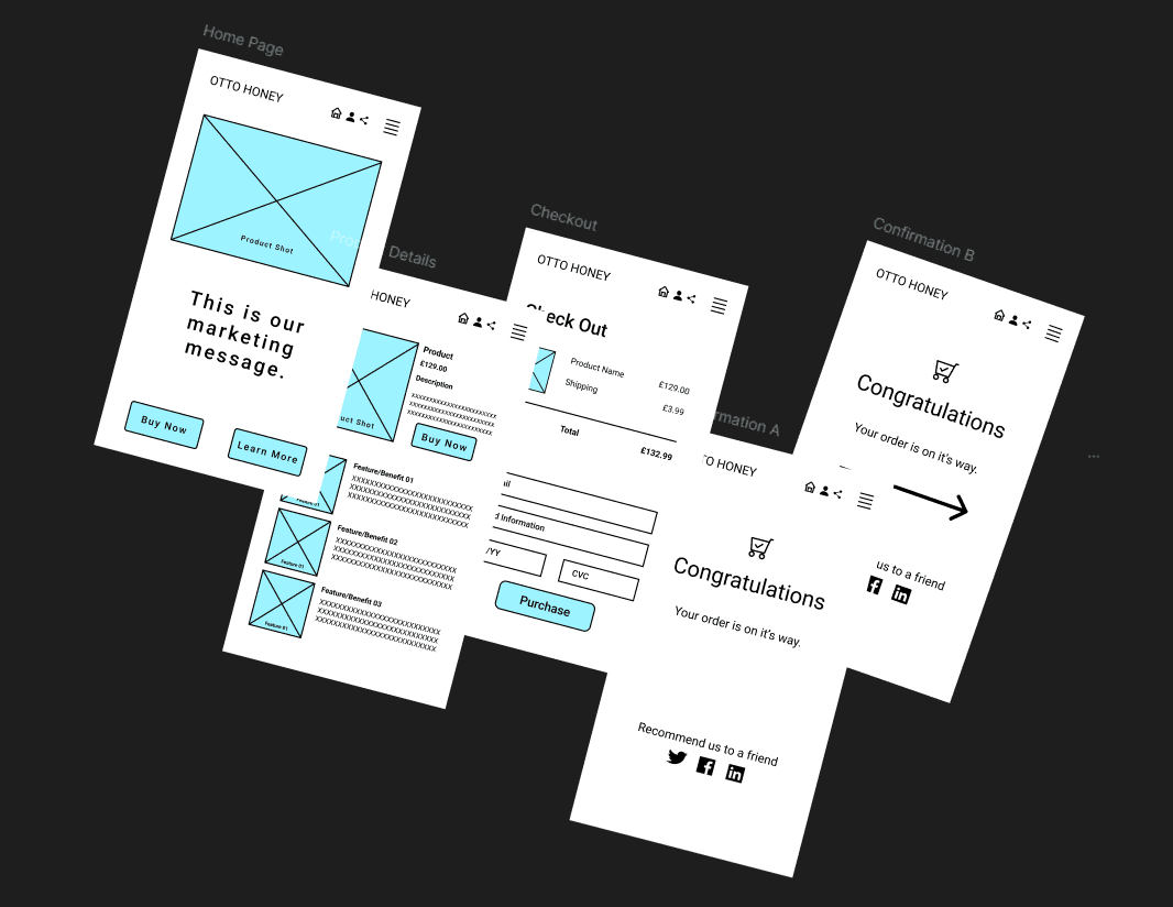
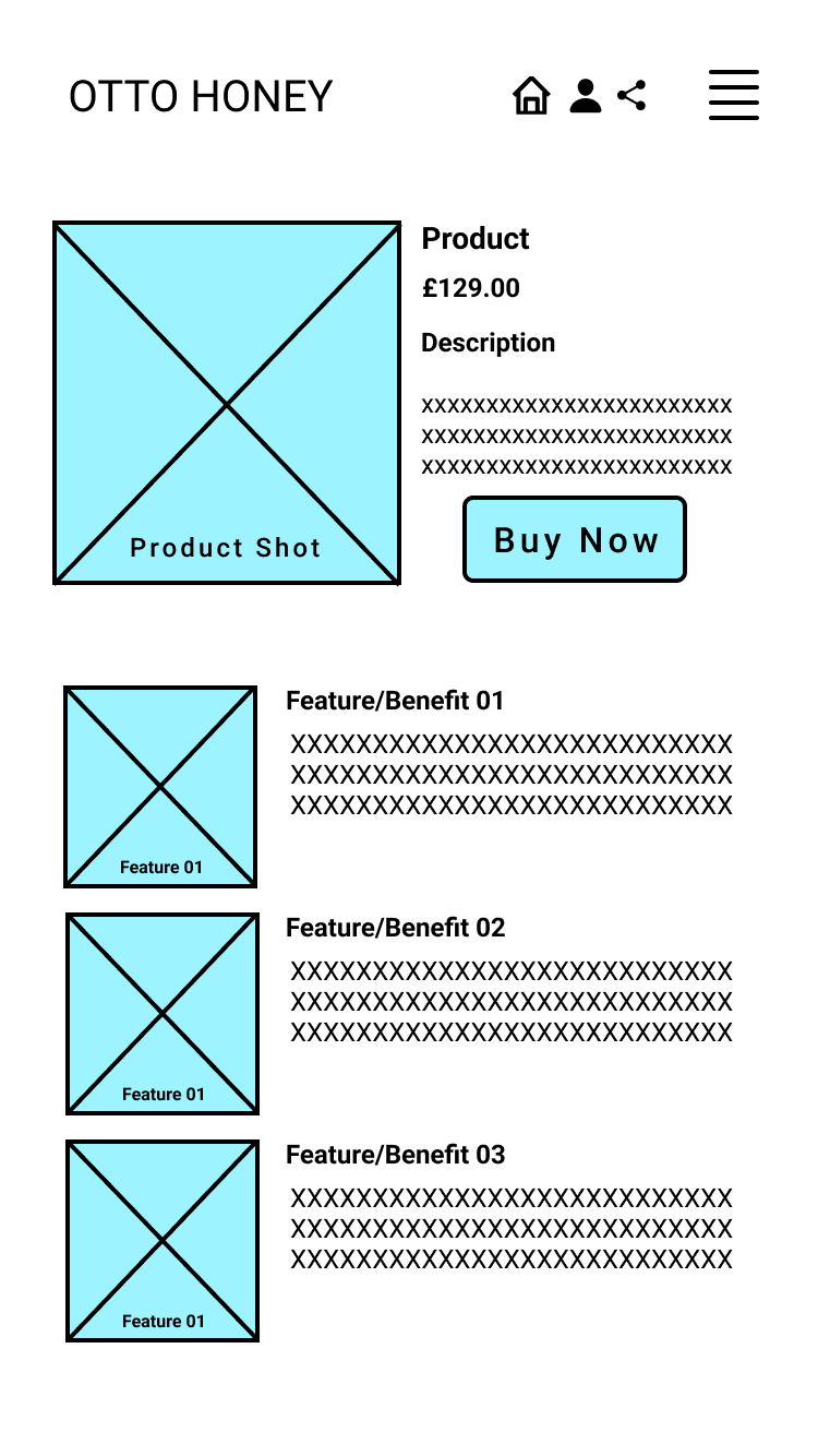
Lo-Fi Wireframes

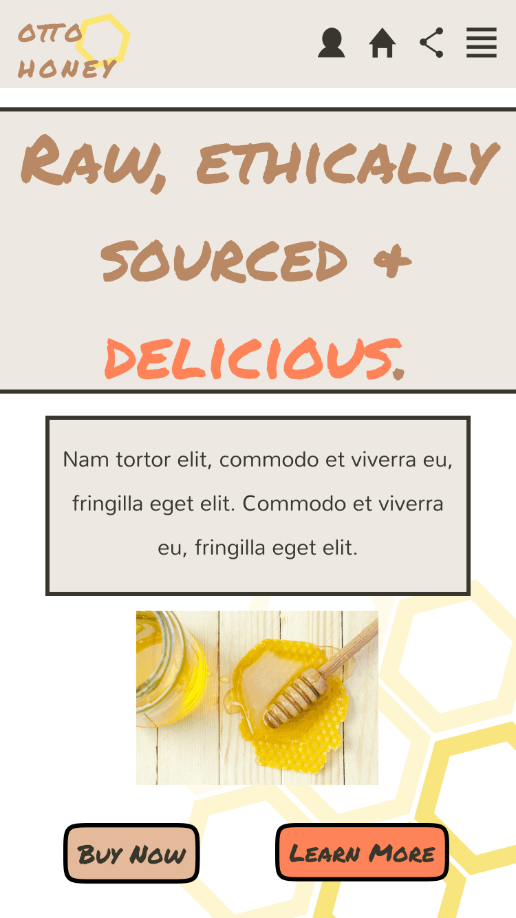


Hi-Fi Prototypes : Mobile Layout
Hi-Fi Prototypes : Desktop Layout
Prototype Interactions
Hi-Fi Prototypes : Tablet Layout
Hi-Fi Prototypes : Mobile Layout
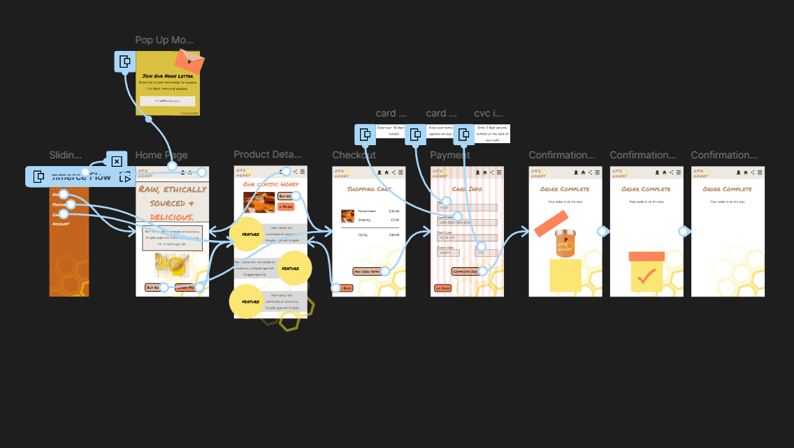
Task Flow@ eCommerce Page
1-Home Page
2-Product Features
3-Checkout
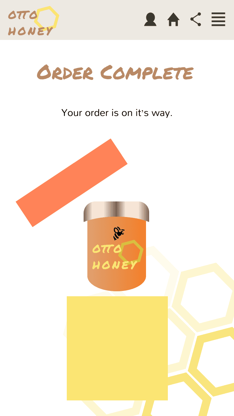
4-Confirmation


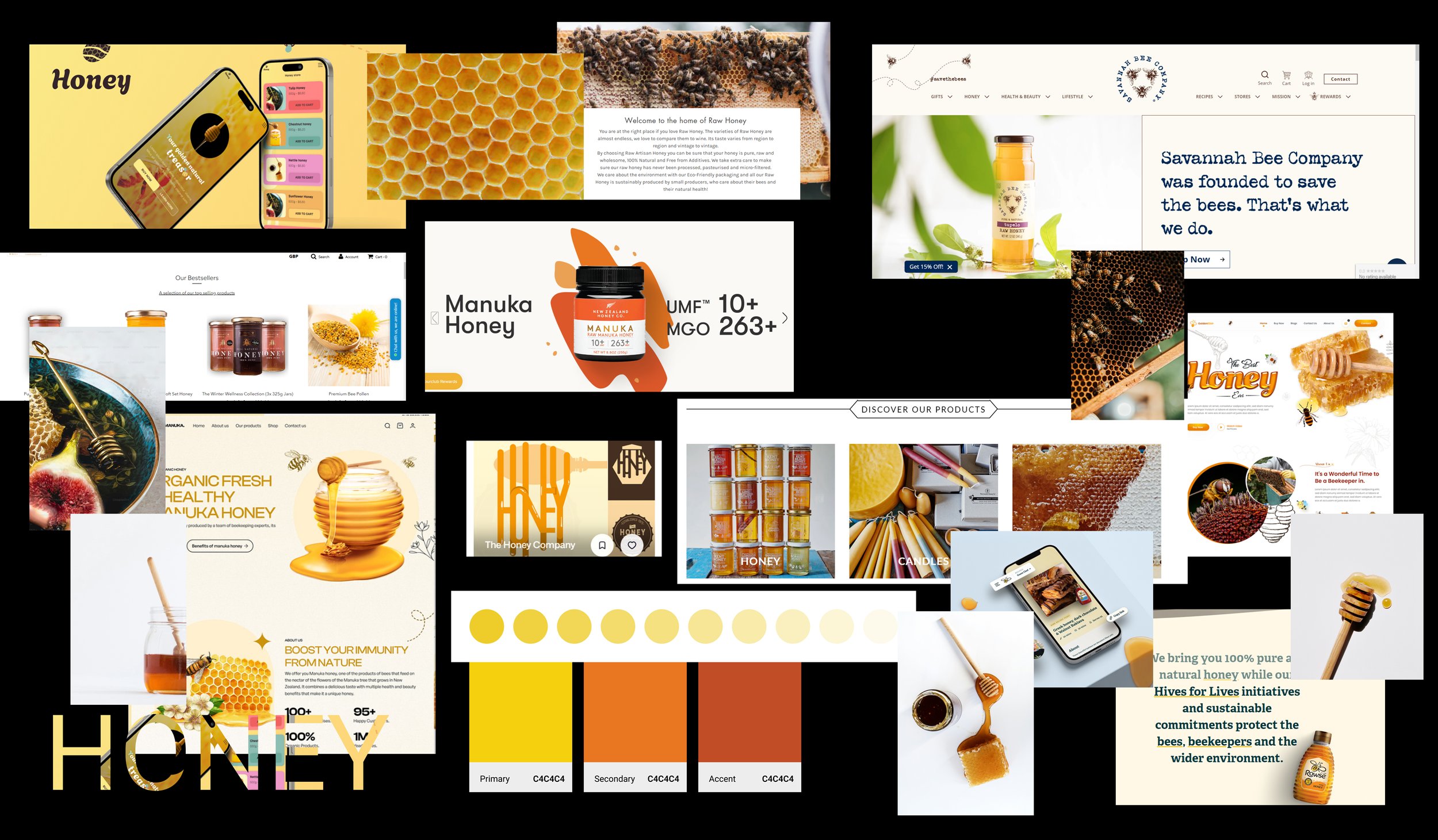
Mood Board
View Prototype
I looked at existing Honey products on the market and how they were presented to customers. I looked at various layouts, colour schemes and images to get a starting point for my designs. Since this project was only concentrating on the design aspects, without user research being conducted, my main reference point for prototype design was my moodboard.
I created this style guide in Figma to use as a reference for typefaces, images, colour schemes and components, to aid consistency in my designs. By using components, I was able to easily modify the design without having to change elements on each individual frame.
Along with my horizontal navigation bar, I added a sliding nav bar to allow users with multiple options for navigation, thus making the purchasing flow easier for users. An alternative variation of my logo was used to ensure user readability and accessibility in terms of colour contrast.
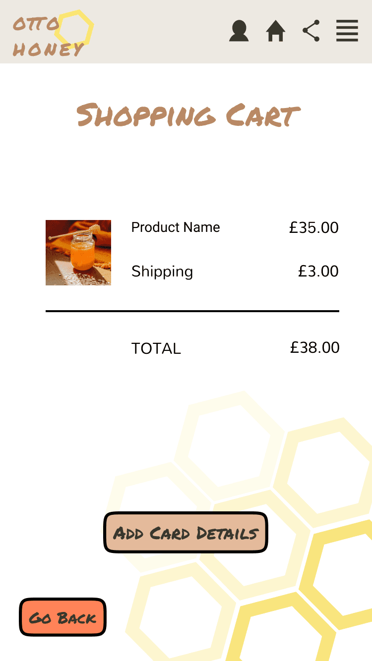
Consistent spacing, font type, headers and navigation were used throughout to ensure ease of use and fluidity in the design. To ensure user control and freedom throughout, back buttons were placed to allow users a clearly marked ‘exit’ pathway, thus inkeeping with usability heuristics.
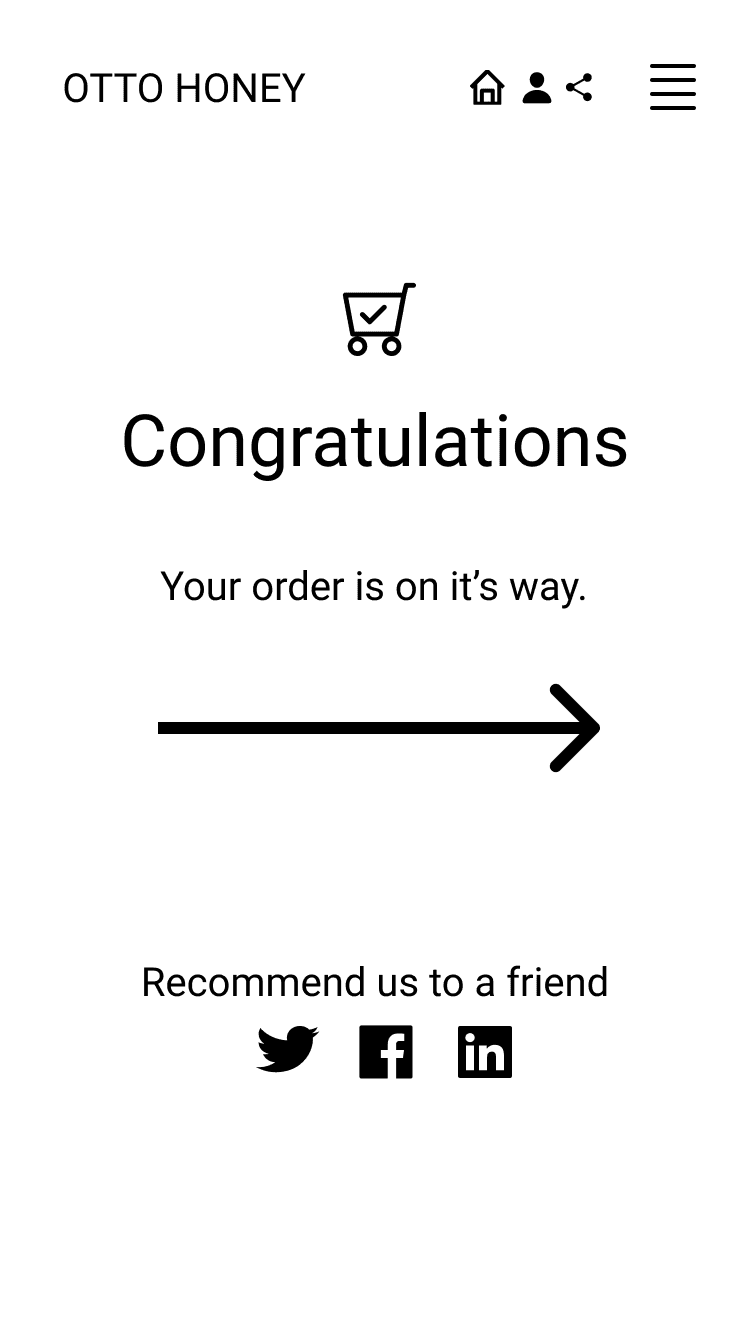
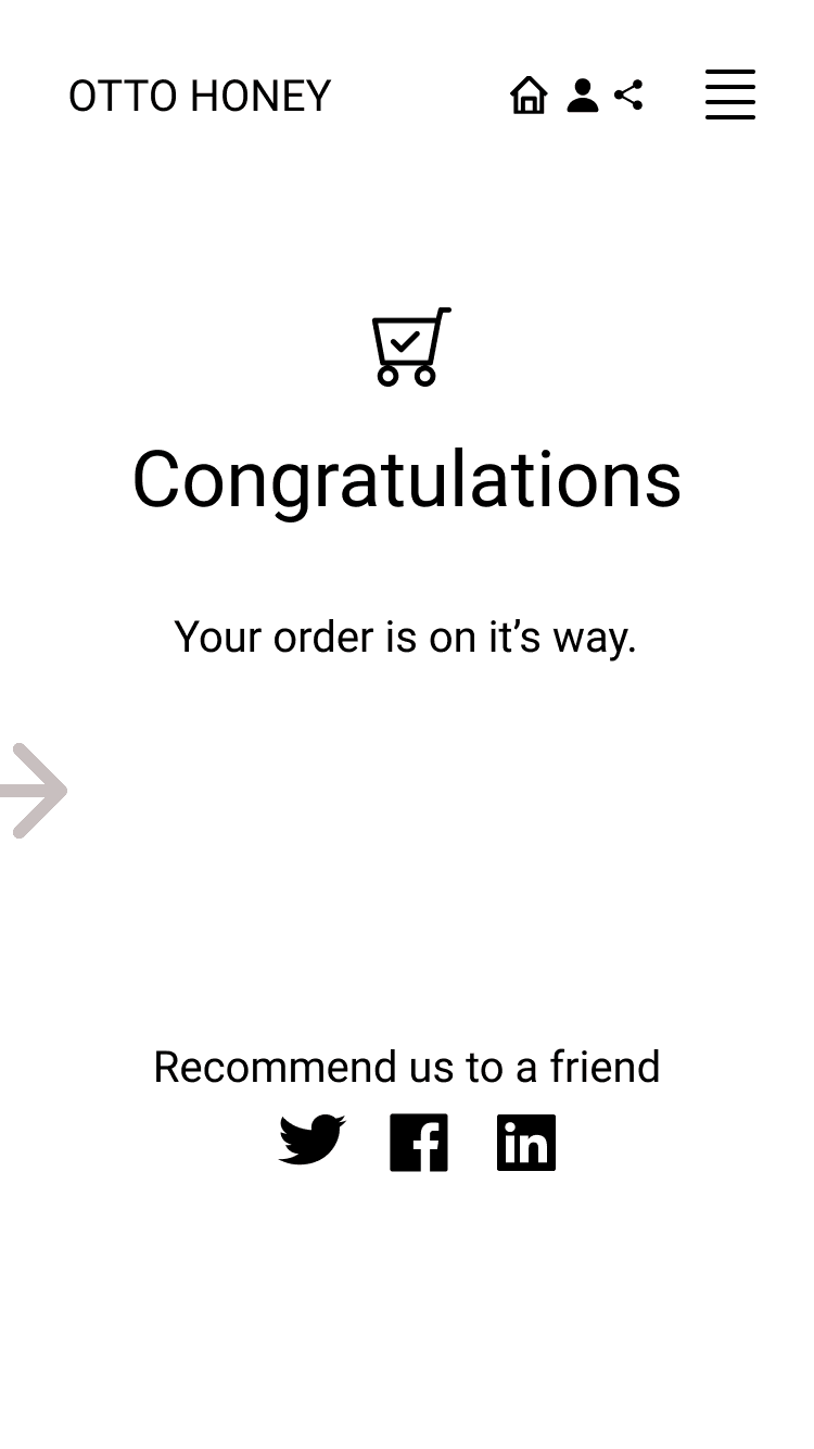
For the confirmation page, a simple animation was created to ensure users were aware their purchase had been completed and provided users with a clear visibility of the system status - ‘order complete’.
Otto Honey
Wireframes and prototypes